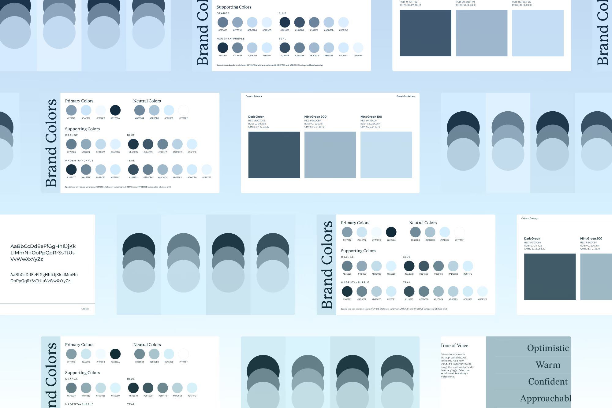
Your Brand Doesn’t Need to Be Blue in Healthcare
By Jules Gordon, Brand Designer at Clearstart
When we work with healthcare companies on building their brands, the adage idea of “blue = trust” somehow always is bound to pop up. We’ve all heard it. But you’re probably wondering: is it actually true?
While I’m not sure there’s any recent or significant evidence proving blue has some magical ability to make people trust you, the idea has circulated long enough that it rarely gets questioned. Healthcare certainly seems to have bought in. Look around, and you’ll find an endless sea of cold, corporate blues and teals out there. SaaS isn’t exactly innocent here either. (Shivers.)
In my opinion, it’s the elusive ✨color theory✨ that really landed us here: the idea that every hue on the color wheel can be reduced to a simple emotional shortcut. You want your brand to feel clean and simple? White. Youthful and vital? Green for you. Friendly and approachable? Orange, obviously. I get it. Color theory is appealing because it feels simple and predictable, two things brand conversations rarely are. And while, yes, white can feel clean and blue can signal trust, we’d be kidding ourselves to pretend that’s the whole story. It definitely plays a part in that bigger picture, though.
Color only works in context
What I don’t want you to think is that I’m saying color doesn’t have any emotional correlation, that brand color choices don’t really matter, or that when I pitch a palette to a client I’m just crossing my fingers and hoping they buy it.
No. Color is deeply evocative. It just doesn’t exist in a vacuum. Like anything that drives emotion, color is tied to context.
What are you actually selling, and how is that different from the next company?
Who are you trying to reach?
What do they care about?
What does your competitive landscape look like?
Is the category visually homogeneous, or are there brands already taking risks?
All of these considerations (and more) should be part of the decision-making around brand colors. Not simply that Gary hates the color green and Lisa has to have at least three secondary colors.
So yes, color theory in essence, the idea that colors carry emotional associations- is real. But it isn’t a cheat code. Color theory works within the context of your brand. Ultimately, your brand strategy should dictate decisions around your palette.
Said another way:
Color theory = emotional associations, broad patterns, highly dependent on context
Brand strategy = audience-specific, competitive, intentional, grounded in business reality
Color theory can inform a palette. Brand strategy should decide it.
“Yeah, but healthcare is different.”
It’s not uncommon for healthcare to feel like an island unto itself when it comes to brand decisions. Founders and CMOs tell us some version of this all the time: “Sure, that might work for a consumer brand. But we’re in healthcare. It’s different.”
And this is where a lot of healthcare brands box themselves in. They assume certain colors, or certain applications of those colors, are automatically off-limits because no one else in the category has done it before. Cue every healthcare brand being blue or blue-ish.
Here’s the truth: healthcare is an industry, not a completely different design universe.
Color works here the same way it works in hospitality, SaaS, retail, or anywhere else: through context. And color is only one part of a much larger design system. You still have typography, imagery, logo systems, layout, illustration, graphic elements, motion, and more. If that system is grounded in an intentional brand strategy, there’s no reason healthcare brands can’t take a more unexpected approach to color.
And this isn’t just a healthcare problem. If you only look within your own industry for inspiration, that’s the equivalent of every mid-2010s software site having diagonal lines and clipart illustrations because “that’s what tech looks like. Respectfully, no thank you.
A not-so-blue healthcare brand
A great example of a healthcare brand taking a more intentional approach to color is Medisafe, a digital medication-management platform that helps pharmaceutical companies scale patient engagement across therapies and markets.
When we began working together, Medisafe’s visual identity leaned heavily on blue and teal gradients. As Golilocks would say, it absolutely “fit just right” in healthcare and digital health, but that was part of the challenge: it didn’t do enough to communicate what made Medisafe distinctive as the company moved further into enterprise pharma. After digging into positioning, the product, audience, competitive landscape, and broader commercial story, we saw an opportunity for the visual identity to better reflect both sides of the business: the credibility required in high-stakes enterprise healthcare and the human behavior change at the center of the product.
That led us to a jewel-toned palette built around deep plum and teal, with brighter analogous accents bringing movement and energy into the system. The idea behind it was Authority with Momentum: credible enough for enterprise buyers, but never static, cold, or overly institutional. And the broader transformation went well beyond color. Medisafe’s positioning, sales motion, brand, website, and marketing evolved together, contributing to a 300%+ increase in average contract value.

“Okay, so never use blue. Got it.”
No, no, no. Blue might be exactly right for your brand, even in healthcare. If we make “don’t use blue” the new rule, we’ve just recreated the same problem: replacing strategy with another shortcut.
My challenge to anyone looking for answers about their brand color palette is simply this:
1. Start with brand strategy.
Positioning, audience research, competitor analysis, business goals. These aren’t optional. If you don’t understand the strategy, what exactly are you using to make design decisions?
2. Put your personal preferences aside.
It’s unfair to your brand’s growth potential to let “I hate orange” become a business strategy. I personally dislike orange and purple, but if I decided to never use those colors in visual identities, I’d seriously limit what I could create.
A) Not fun.
B) Quite the disservice to our clients.
3. Be open to being different.
Color is only one part of the system, but it can be a powerful place to differentiate without blowing up the entire category playbook. The goal isn’t to be different for the sake of being different. It’s to make choices that are right for the brand you’re actually building.
Blue isn’t the problem. Choosing it by default is.
Your palette should come from the same place every other meaningful brand decision does: a clear understanding of who you are, who you’re trying to reach, and what you need to communicate.
If that leads you to blue? Great.
If it leads you somewhere completely unexpected? Even better.